Volunteer Design: Special Event Logo
As I’ve previously discussed, I’ve volunteered my time and talents to several extremely worthwhile nonprofit organizations through Catchafire. It’s been incredibly rewarding, and it’s such a joy to do work I love while serving those doing good for the world and helping others.
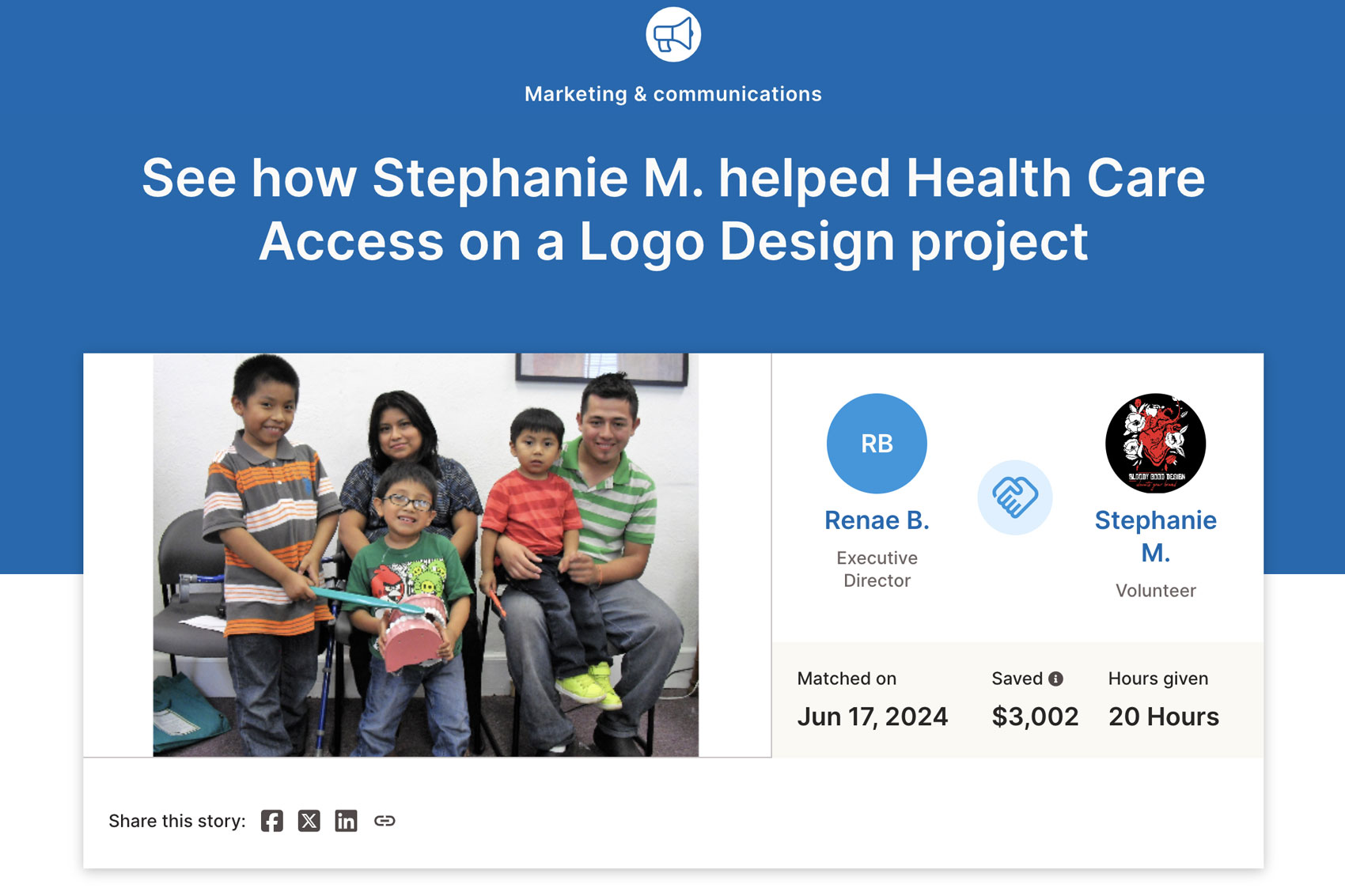
Most recently, I worked for Health Care Access (HCA). Their mission is to improve the health and quality of life in the greater Phoenixville area by helping the uninsured and underinsured overcome financial and cultural barriers to obtaining specialized health care.
The organization is celebrating 25 years as a nonprofit, having helped over 20,000 people in the community with access to dental, vision, prescriptions, and mammogram services. They asked for a logo they could use over the next year to recognize this milestone.
HCA had an existing logo they were very happy with and desired to incorporate into the new design. This meant I had to creatively integrate new elements to make the logo feel unique and special for this anniversary celebration without fundamentally altering the existing logo in any way. This posed a unique but fun challenge.
THE PROCESS
We had a brief introductory call. They explained they did not have a specific vision for the new logo, nor did they have established brand guidelines. They did explain that they wanted to ensure the new logo still read as closely related to their existing logo and that it greatly emphasized the 25 years of their organization’s community involvement.
They also explained they had a very limited color palette, essentially using just one color, and they did not have any other colors they wanted to incorporate in this new logo, posing a unique design challenge. However, they were open to shades of purple or a silver accent color if needed.
They sent over a few rough sketches for some possible ideas but let me know I had full creative control to tackle their creative challenge best based on my extensive expertise.
I immediately got to work sketching. I must admit that it was not easy due to the shape and specific design of their existing logo. Incorporating the various new elements in a cohesive way that elevated the brand without changing the core design proved challenging, but I love a good challenge!
From my sketches, I developed six unique concepts. I then narrowed it down to my top four options to send to the client for feedback; I love to provide multiple options without overwhelming the client with too many choices in the initial review.
They immediately fell in love with one of the options and requested no changes, which is always such a great feeling of accomplishment.
THE IMPACT
I helped the organization save an estimated $3,002 in creative service fees, allowing them to use their limited funds to focus on other strategic projects.
I received the following feedback upon completing the project:
“Stephanie was amazing to work with. She understood our vision from the first time we spoke and executed it beyond our expectations. I would recommend Stephanie to anyone who is need of a logo design. She was able to provide some logo options within a few days of our initial conversation. Thank you so much.” Renae B., Executive Director, Health Care Access
View the complete impact statement here.
Below, you can view the original logo I was working from, the four concepts I shared for the anniversary logo, and the final logo the client selected.


